October 10, 2026


Most student portfolios do not fail because the work is weak. They fail because the evidence is missing. A tutor knows what a second-year project looks like. An employer or admissions reader scanning your folio for ninety seconds does not. All they see is a screen of images and a few thin captions, and they are left to guess at everything else. The reassuring part is that the faults are almost always the same handful, and every one of them has a fix you can start tonight.
The most common entry in a student portfolio is a single, polished final image floating on white, with a title underneath. It looks tidy. It also tells the reader nothing about how you think, which is the thing they are actually assessing.
Give each project three beats: the brief, the decisions, the outcome. Under the brief, write two sentences in your own words about the problem and any constraints you were given. Under the decisions, show the messy middle. Under the outcome, present the finished piece properly.
The messy middle is where portfolios win. A rejected route with one line explaining why you abandoned it is worth more than three more photographs of the final object. If you spent a fortnight on a colour study and then went in a different direction, show it and say so. Readers trust a maker who can explain a dead end.
A beautiful object photographed badly reads as a mediocre object. This is not about buying equipment. A modern phone, a window and twenty minutes will beat a rushed shot under an orange ceiling light every time.
Sketchbook pages deserve the same care. Scan them if you can, or photograph them in flat, even light without a hand shadow creeping across the corner.
Overcrowding is usually anxiety in visual form. Eight projects of equal weight, three columns of text, a patterned background, and a carousel of images that never settles. The reader's eye has nowhere to land, so it leaves.
Choose three or four of your strongest projects and let them breathe. One clear focal image per page or spread, two or three lines of supporting text, and generous margins. A second, smaller image can sit beside the main one; a third rarely helps.
Ask yourself what a single page is for. If the answer is "to show the whole project", split it into two pages. Order beats quantity every time.
"Final poster" and "Model, 2024" are labels, not captions. They waste the one piece of writing a reader is most likely to read.
Compare that with: "Third iteration. The heading felt too heavy at full size, so I reduced it and widened the margins around it." Same project, same photograph, completely different impression of the person behind it. The second version shows judgement, vocabulary and self-awareness.
Write in plain sentences. If a term only makes sense inside your course, either explain it in five words or leave it out. Keep captions to one or two lines, and be specific about materials, scale and time where it is relevant. "Hand-built ceramic, roughly 30cm tall, fired twice" tells a reader far more than "sculpture".
Team projects are excellent portfolio material and a common source of confusion. If your name is attached to a group outcome, a reader will not assume anything about your contribution unless you tell them.
Add one short line near the top of the entry: "My role: research, early wireframes and the booking flow." Then a sentence on what the group decided together. Honest, precise attribution reads as professional rather than boastful, and it protects you from the awkward question in an interview.
Chronological order is the default and rarely the best choice. Lead with the project that best matches the work you want next, not the one you finished most recently. Put your strongest piece first, your second strongest last, and let the middle hold the rest together.
Consistency does most of the quiet work. One typeface, one grid, one caption style, one way of naming your files. Small things like aligning a title to the same left margin across every page give a folio a sense of control that readers notice without knowing why.
Set aside an evening and work through your folio in this order:
Then leave it alone for two days and read it again. Most of what still feels wrong will be obvious by then. A portfolio is never finished, only handed over, so aim for clear and honest rather than perfect. If you are applying somewhere with specific submission rules, check those requirements before you start cutting, because a well-presented folio that ignores the brief is still a folio that gets set aside.
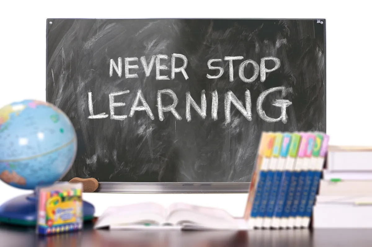
Photo: geralt / Pixabay

Curated portfolios for creative professionals.
Copyright © 2026 Ideal Folio. All rights reserved. Ideal Folio.